A single dashboard that pulls together attendance, visit duration, care reviews, training compliance, alerts and incidents, so you can see and evidence your CQC compliance without digging through separate tabs.
What the Compliance Dashboard is
CQC inspections are built around five key lines of enquiry, or KLOEs: Safe, Effective, Caring, Responsive and Well-led. Today, showing an inspector you are on top of all five usually means jumping between separate tabs for attendance, visit duration, care reviews, training and alerts, and pulling the picture together yourself.
The Compliance Dashboard puts all of that in one place. It brings together the metrics that matter most for compliance, filterable by date, client and care worker, so you can see at a glance whether your agency is on track, drill into any client or care worker in detail, and export the evidence when you need it. It is built to make audits and day to day compliance checks quicker, not to replace your judgement.
Step 1: Set your filters
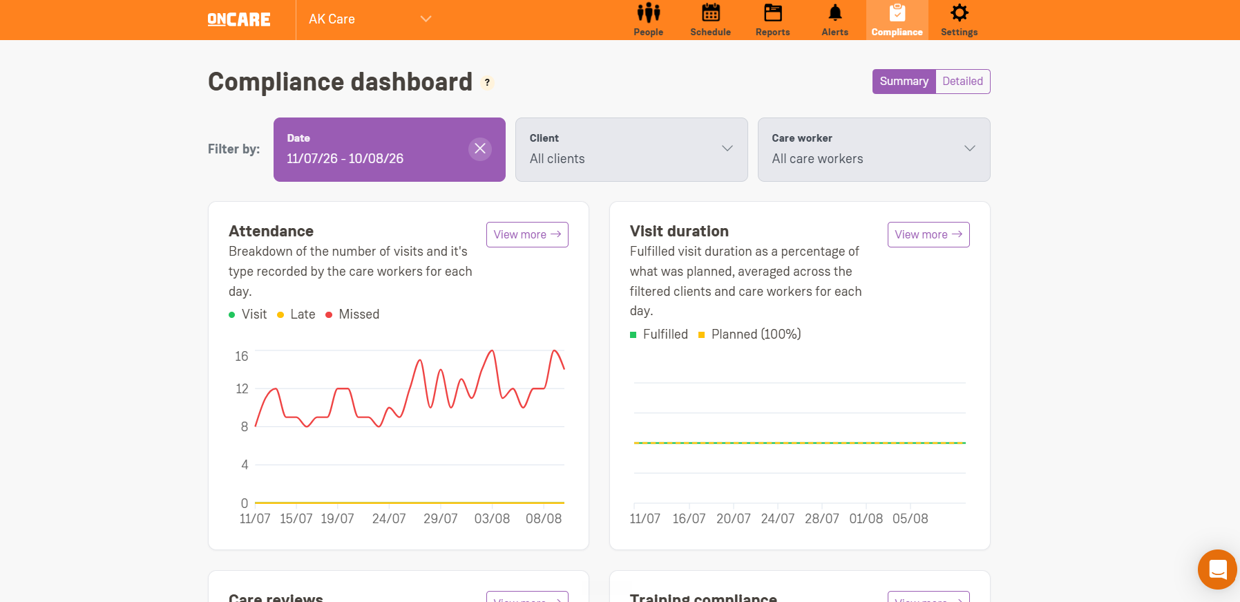
At the top of the dashboard there are three filters: Date, Client and Care worker. You can use them in any combination, for example Date on its own, Date and Client, Date and Care worker, or all three together.
Most metrics need a Date to be selected before they will show any data. Until you pick one, they display a "Please select a date" message.
Care reviews and Training compliance are the two exceptions. They always show a live, agency-wide snapshot as of today, regardless of what Date is selected.
Step 2: Read the metrics
Each metric appears as a card with a title, a short description, headline numbers and a chart. Click View more on any card for a full breakdown, day by day.
Attendance
Tracks how care workers performed against their scheduled visits in the selected period: Total visit (scheduled visits actually carried out, checked in and checked out), Total late (of those, how many started later than scheduled), and Total missed (scheduled visits with no check-in at all). A visit that is still in progress is not counted as either completed or missed until it finishes.
Visit duration
Shows Avg. fulfilled, the average percentage of the planned visit length that was actually delivered, across completed visits in the period. A dashed line at 100% makes it easy to see which days ran short or long against schedule. Days with no completed visits are shown as 100% rather than 0%, so a quiet day does not look like a problem.
Care reviews
A live, whole-agency snapshot of every client's care plan review status: Overdue, Due soon, Up to date and Not started. The Due soon window is the same setting used on the Care reviews page (Settings, Care review settings, "How far in advance should reminders be sent?"), so changing it there changes what shows here too.
Training compliance
A live, whole-agency snapshot of every staff member's course completion status, sourced from Florence Academy: Completed, On track, Expiring soon, Overdue and Incomplete. The card notes when training data was last synced from Florence, which happens on an hourly basis.
Note
Florence Academy must be enabled for your agency for this card to appear.
Alerts
Total unresolved and Total resolved alerts raised in the period, whatever the reason (late visit, missed medication, distance/geofencing, or a flagged visit report). Resolved and unresolved reflect the alert's current status, not its status on the day it was raised, so the numbers can shift as your team works through them.
Alert types
A proportion breakdown of why alerts were raised in the period: late visits, medication alerts, distance alerts and report alerts. A toggle underneath switches the whole chart between Unresolved and Resolved.
Incident trend
Total incidents logged by care workers during visits in the period, shown as a daily chart so you can spot when incidents cluster rather than just seeing an overall count.
Step 3: Drill into a day, a client or a report
Click View more on a card to see a row for every day in your selected range. Click a row to see the detail for that date, and use View report to go straight to the underlying visit report where relevant.
Training compliance and Alert types work slightly differently: View more on those takes you to the existing Staff training matrix and Alerts pages instead, since that is where the fuller detail already lives.
Why a day might be missing from the list
The detail page only shows rows for days with at least one valid piece of data, for example at least one visit. A day with nothing to report will not appear as a row, even though it is still shown as 0 on the chart.
Step 4: Switch between Summary and Detailed
In the top right of the detail page you can switch between Summary (two cards per row) and Detailed (one card per row, with a total sum for the metric across your selected date range).
Step 5: Export and share
Attendance, Visit duration, Care reviews, Alerts, Incident trend and Alert types can all be exported. Click Download next to the metric name to get a CSV of every row currently on screen, for your own records or for an inspector.
CSV exports are capped at 92 days per export, to keep the load on our servers reasonable. For a longer period, export in smaller chunks.
There is also a search bar on the detail page that filters rows by the date you type in.
Shareable, filtered links
Whatever filters you have selected are saved into the page URL. That means you can copy the link and send it to a colleague, and they will land on the same filtered view, for example the same date range and client.
Need help?
If you have any questions about the Compliance Dashboard, contact your account manager at any time.